

UX Research / UX Strategy / UI Redesign / Gamification / Visual Design / High-Fidelity UI
Creative Direction / Concept Development / Prompt Design / AI Image Generation / AI Video Generation / Video Editing / Sound Design
Buildd - Business Learning Platform
Buildd - Business Learning Platform
Revamping the learning Path page for Buildd ( Academic UX Concept | Personal Redesign )
Revamping the learning Path page for Buildd ( Academic UX Concept | Personal Redesign )
Revamping the learning Path page for Buildd ( Academic UX Concept | Personal Redesign )
Project Overview
Project Overview
Buildd is a business learning platform that helps users develop practical business skills through short, interactive learning sessions. This concept redesign focused on reimagining the Learning Path experience to improve engagement, course progression, and overall usability.
Buildd is a business learning platform that helps users develop practical business skills through short, interactive learning sessions. This concept redesign focused on reimagining the Learning Path experience to improve engagement, course progression, and overall usability.
Buildd is a business learning platform that helps users develop practical business skills through short, interactive learning sessions. This concept redesign focused on reimagining the Learning Path experience to improve engagement, course progression, and overall usability.
Problem Statement:
Problem Statement:
The existing Learning Path interface lacked visual hierarchy and interactive elements, making the learning experience feel static. Users had limited visibility into their course progress, no integrated note-taking feature, and few incentives to stay engaged throughout the learning journey.
The existing Learning Path interface lacked visual hierarchy and interactive elements, making the learning experience feel static. Users had limited visibility into their course progress, no integrated note-taking feature, and few incentives to stay engaged throughout the learning journey.
The existing Learning Path interface lacked visual hierarchy and interactive elements, making the learning experience feel static. Users had limited visibility into their course progress, no integrated note-taking feature, and few incentives to stay engaged throughout the learning journey.

Original Experience
Original Experience
Key Pain Points
No clear indication of course progress.
No integrated note-taking functionality.
Users had to revisit entire videos to find important information.
Limited motivation to continue learning.
Minimal visual engagement.
Key Pain Points
No clear indication of course progress.
No integrated note-taking functionality.
Users had to revisit entire videos to find important information.
Limited motivation to continue learning.
Minimal visual engagement.
Key Pain Points
No clear indication of course progress.
No integrated note-taking functionality.
Users had to revisit entire videos to find important information.
Limited motivation to continue learning.
Minimal visual engagement.
Design Goals
Design Goals
The redesign aimed to:
Improve visibility of course progression.
Introduce an integrated note-taking experience.
Encourage continuous learning through gamification.
Create a cleaner, more engaging, and visually appealing interface.
The redesign aimed to:
Improve visibility of course progression.
Introduce an integrated note-taking experience.
Encourage continuous learning through gamification.
Create a cleaner, more engaging, and visually appealing interface.
The redesign aimed to:
Improve visibility of course progression.
Introduce an integrated note-taking experience.
Encourage continuous learning through gamification.
Create a cleaner, more engaging, and visually appealing interface.
Visual Direction
Visual Direction
A refreshed visual language was introduced using a dark interface with purple and yellow accents to improve readability, strengthen visual hierarchy, and create a more immersive learning experience.
A refreshed visual language was introduced using a dark interface with purple and yellow accents to improve readability, strengthen visual hierarchy, and create a more immersive learning experience.
A refreshed visual language was introduced using a dark interface with purple and yellow accents to improve readability, strengthen visual hierarchy, and create a more immersive learning experience.

Redesigned Experience
Redesigned Experience
The redesigned interface transforms the Learning Path into a more structured and engaging experience by introducing progress tracking, contextual note-taking, and a level-based progression system inspired by gamification principles.
The redesigned interface transforms the Learning Path into a more structured and engaging experience by introducing progress tracking, contextual note-taking, and a level-based progression system inspired by gamification principles.
The redesigned interface transforms the Learning Path into a more structured and engaging experience by introducing progress tracking, contextual note-taking, and a level-based progression system inspired by gamification principles.
Design Improvements
Design Improvements
Added a visual progress tracker to monitor course completion.
Introduced in-app note-taking for quick reference.
Designed a level-based progression system to encourage continuous learning.
Improved content hierarchy and navigation for a more intuitive experience.
Added a visual progress tracker to monitor course completion.
Introduced in-app note-taking for quick reference.
Designed a level-based progression system to encourage continuous learning.
Improved content hierarchy and navigation for a more intuitive experience.
Added a visual progress tracker to monitor course completion.
Introduced in-app note-taking for quick reference.
Designed a level-based progression system to encourage continuous learning.
Improved content hierarchy and navigation for a more intuitive experience.
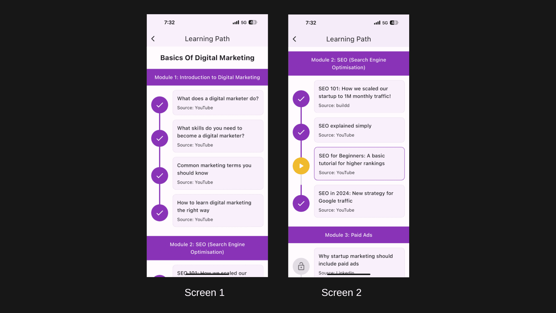
Before & After
Before & After
A comparison between the original and redesigned interface highlighting improvements in usability, engagement, and visual hierarchy.
A comparison between the original and redesigned interface highlighting improvements in usability, engagement, and visual hierarchy.
A comparison between the original and redesigned interface highlighting improvements in usability, engagement, and visual hierarchy.

Reflection
Reflection
This redesign explored how small UX improvements—such as progress tracking, note-taking, and gamification—can transform a passive learning experience into a more engaging and motivating journey for users.
This redesign explored how small UX improvements—such as progress tracking, note-taking, and gamification—can transform a passive learning experience into a more engaging and motivating journey for users.
This redesign explored how small UX improvements—such as progress tracking, note-taking, and gamification—can transform a passive learning experience into a more engaging and motivating journey for users.